|
Color Theory Project
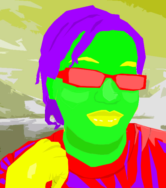
I used tetrad for my color theory project. I think it matches my expression very well. I selected Antarctica as my background because it is a subtle peaceful place, which is what a background should be like. I did use tints, tones, and shades. I think color is the strongest element in my project. Photo Unit
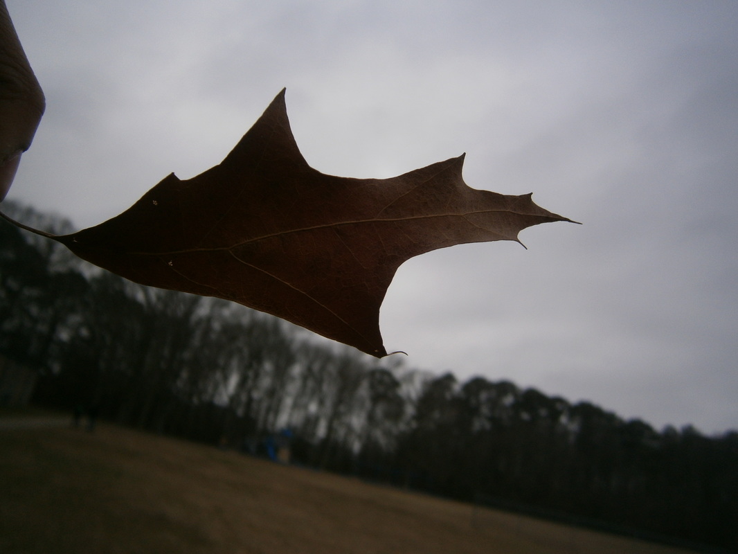
I used black and white for my first photo. I selected it because the angle the picture was taken in makes it look interesting. I feel that perspective plays the most dramatic role in this piece. In the second picture, I used silhouette. I selected it because it is by far the most dramatic piece in the entire collection. The key to its success is the element of value in both the sky and the leaf. Personally, I enjoyed learning about digital photography because it gave me a chance to go out and create something different than an image on the computer. I enjoy creating both, but it was nice to make a switch every once in a while. Critter Montage! Tigerpup
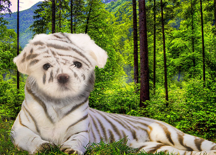
I used a tiger and a puppy to make my critter. The stamp tool worked best during this project because it helped me to copy and paste, which is essential. Pattern and colour were the strongest elements in my montage. The stripes on the tiger drew the most attention to the photo. Colour was strong because the black and white on the tiger and the bright green background contrasted nicely. Tessellation
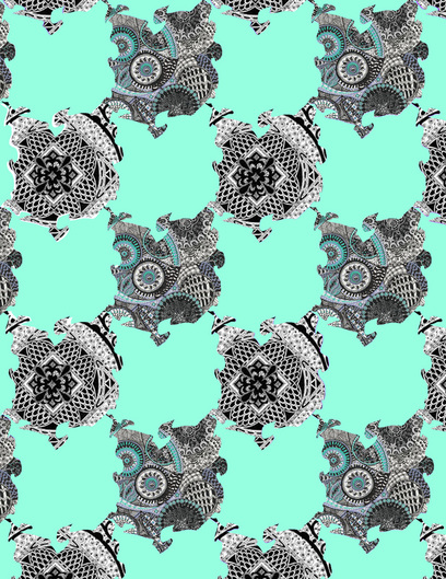
I think pattern and line were the most important elements and principles. Making a tessellation on the computer is easier because all you have to do is cut and paste. i think that the blue in one of my patterns might clash with the mint green pieces. We learned about M.C. Esher before we started the project. My Fontbot project
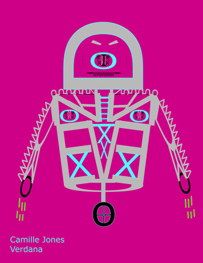
My fontbot is sans serif. I think that the font matches the type of fontbot I made. It was a long, but enjoyable project. My favorite part was designing the torso. The backstory for my fontbot is that it was created in and evil science lab, but one of the scientist's kids accidentally released it. |
|
My Square One Art Project
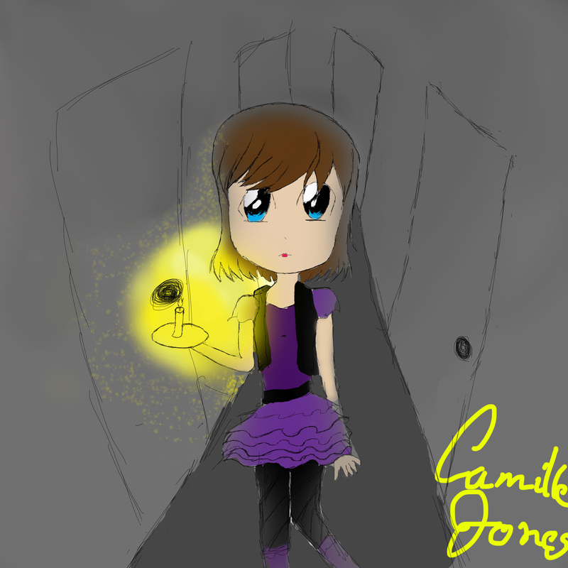
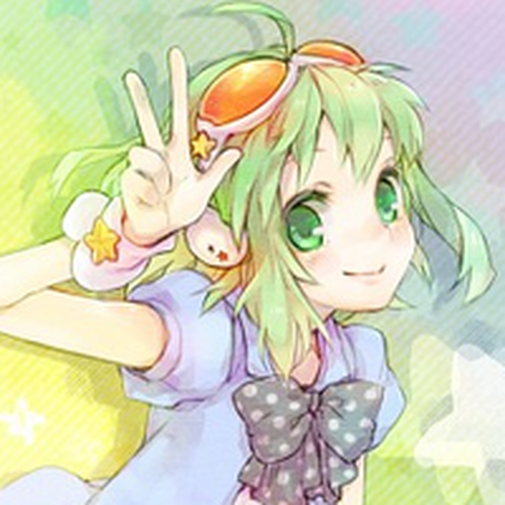
To create my Square 1 image, I had to blend my illuminated candle into the dark hallway background, so I used a special brush I found to give the area around the candle a sort of sparkling effect. my strongest element and principle used were perspective down the hallway and emphasis on the candle. I liked using the tablet because it is a lot like using a pencil and it was much easier to control than a mouse. I used values over high contrast by letting the hallway gradient from darker in the back to lighter in the front and her hair fading into the dark and a light source (the candle). I am very fond of this particular illustration of megpoid gumi the anime vocaloid. In fact, this particular picture is on my homepage banner. The light pastel coloring, not unlike it's starry, cheerful background, gives the whole picture a sense of happiness and serenity.
|
